Thou shalt accomplish the task
1) Get commissioned.
I used to work at the gallery, so they know me. This bit was key to me scoring this job.
Scrawling text onto the interior walls of Manchester Art Gallery's early 19th collection is no mean feat; the text in question is the Ten Commandments according to Gilbert and George. It needed to be in gold and in the typeface "Anglican Text." This was part of the current "Do It!" exhibition, which in turn forms part of the current Manchester International Festival.
2) Panic and figure out how to do it.
Having never done wall-lettering before was another daunting aspect, now however, I am happy to say that I am available for weddings, bat mitzvahs etc. Here is a quick tutorial detailing the process which thankfully worked for me:
- Purchase some thin wooden boards to practice on.
- Find techniques that work and email images to the client to reassure them.

Thou shalt reason that gold pens were
the way to go (in this case a bullet tip Poska Pen).
4) More figuring out and cracking on with it.
I became increasingly concerned that I could not freehand a specific typeface. Moreover, It had to look deadly accurate and I needed to work up a ladder so the idea of doing it entirely freehand was out. I looked on-line to see what other people had done.
- Rule evenly spaced lines on the wall.
- Print out the text in large light grey and stick the printed A4 sheets together using low-tack masking tape.
- Get some carbon paper and masking tape it onto the walls.

Thou shalt trace over fancy lettering.
- Stick the printed A4 text over the carbon paper and trace over it with a pencil.
- Remove the paper to see the text on the wall
- Go over it in gold pen.

Thou shalt do one at a time to avoid smudging.

Thou might get tennis elbow.

Thou shalt stand back and admire.
- Chug down free wine at the exhibition preview.

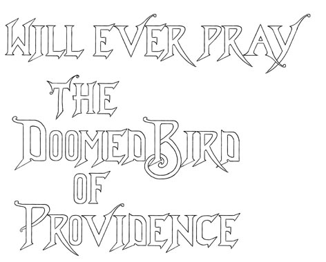
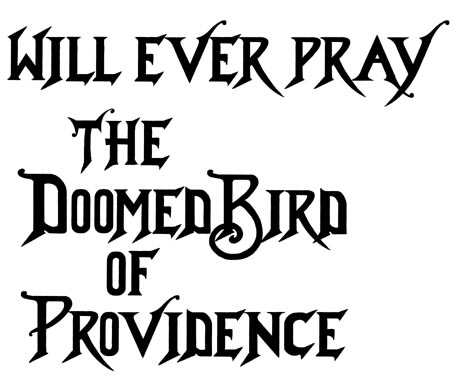
I was given a print out with this lettering in black and white.
Copy on to wall (skirting board). I said this was the easy bit.

Start repenting!
- Get credited on labels!

Thou shalt have name mentioned alongside the more famous.
Thanks to all the staff at MAG including Natasha Howes and Paul Morley.