Showing posts with label design. Show all posts

Tuesday, 10 June 2014

After Eden

Promotional work for music group "After Eden."

Involved creating a logo and turning a photograph into a comic-book style image. Tools used: ink and pencils including some tracing. The group have a Facebook page here: www.facebook.com/weareaftereden

 The band with logo...

...And the logo on it's own.

Saturday, 12 October 2013

Inglorious Bastard

A couple of months ago, a commission arrived in my inbox which was so baffling in concept that it made me think that a friend was playing a trick, just to see what the most outlandish thing I would ever draw for the promise money could be. However, soon I found myself getting stuck in, getting down with the synopsis presented before me and treating this job the same as I would with any other; by employing a high degree of professionalism (what? I can be all self-promoty sometimes.) ...I can't wait to read it.

I'm rambling. The project was an E-book cover image for a story titled "The Adventures of Bastard." The Author is Sam Gwillim and it is unleashed upon the world in December this year.


I won't say any more about the project, rather I will leave it to the official website which acts as a virtual  companion to the book; containing extra features, diary excepts from the characters and fun facts. Go there: http://adventuresofbastard.com/


Thursday, 26 September 2013

Dangerous Games!

Remember school books? Usually they were boring and occasionally stank of fish for some reason. The ones I was involved with, not so much. Back in 2009 I co-illustrated a series of books-for-schools entitled "Dangerous Games."

The concept behind the book is best illustrated by quoting from Rising Stars UK (those who hired me): 

"This exciting range of adventure stories features a trio of computer games 
designers testing out their work for real, entering new virtual worlds and 
encountering exciting and sometimes deadly situations."

Essentially it was my job to illustrate those scenes which take place in the real world, whilst another artist, Rob Lenihan provided the artwork for the more colourful virtual world.

Kojo gets busy making the ultimate video game...

The idea behind the series is to get "reluctant readers" into books via the approach of both video games as a subject matter and a comic book stylistic approach. Probably would have worked for me when I was at school and all I could think about was going home to play on my ZX Spectrum or Sega Megadrive (depending on what year it was).

Skip forward to 2012 and the prospect of illustrating a second series was thrown my way. Of course I said yes! By 2012, I was into using brushes rather than pens to create my lines. See if you can see a difference between the image above and those below. Just for the record, I used (and continue to use) a "Pentel Color Brush." Larger black areas were usually filled in with a black marker, whilst for straight lines I opted for a the classic, cheap Berol Fine. Backgrounds were achieved by scanning in some painted sheets of paper (the same two or three repeated throughout the books.) Compiled in Photoshop.

 Who needs a TV when you've got T-Rex?
The plucky trio go to a museum to inspire a video game.

 Fun and frolics in the office with Tom, Sima and Kojo.

 Just goggle it.

Making video games is no picnic, oh wait, it is!

I massively enjoyed the project. I was given clear instruction and yet, the freedom to employ my preferred style, which I would later go on to employ for the Long Division With Remainders project. If you are in education go and order these books today!! ...Tell 'em I sent ya.

Tuesday, 30 July 2013

How I got Started in Illustration - Part 3

I'm gonna make this post really short...because life is short; less talking, more doing I say! My first real commission was a children's book entitled Matthew and the Money tree. It can still be found on such websites as Amazon ---> right here.


The cover is still the most epic aspect about the book.

I got the job through a site called "Elance" ...it's one of those bid-for-projects sites in which talented people under-cut each other ensuring that few people get paid what they're worth and where non-discerning clients get said work very cheaply. Those were dark times and I usually begrudge such sites even though I am in the unfortunate position of crawling back to them once more despite bigger projects since my first commission. Odesk is another such site. You "could" say they are useful for those starting out, at a push. As an artist with moderate success, I find such sites a pain in the arse; whereas students from the Philippines probably have some financial success out of them. Suffice to say, my fee for Matthew and the Money Tree was small.

This is one of the better pages.

The work was fraught with other problems too, namely a lack of consistency in my drawings. I remember that after finishing the book, I had to go back and visit each page and create new heads for "Matthew" because he looked different from page to page. This was a lack of experience on my part in creating anything sequential. What I should have done was create "style sheets" from which to draw reference.

One such page I had to re-visit for head-swapping.

Despite my problems with inexperience and the sheer disheartening workload of the book, I am glad I did it. Better things were to come... by which I do not entirely mean nightclub flyers such as this one:

Apparently they all died of scurvy. 

I was also in a design "collective." ...I did that drawing of women in a boat whilst someone else did the design work. I will always be eternally grateful for such opportunities but boy does the drawing make me cringe. 

Friday, 31 May 2013

Video Killed the "Illustratar"

I made a youtube video. It has most of my best work on it, though annoyingly there are a few things I forgot to add. Ah well, gives me scope for a sequel. I'd be interested to know from other illustrators and arty types if they've made portfolio videos. ...Leave comments below.


Monday, 22 April 2013

Fact or Fiction: The Paris and M6 Crashes

I'm published: fact. Not quite for the first time, but this time could be interesting. I was contacted some year-and-a-half ago by a man called Colin Hall. Colin claims to be a security consultant whose job has taken him literally around the world. A paranormal enthusiast, he has become meticulously embroiled in intently investigating some online rumours about mysterious crashes, disappearing bodies and some curiously related blog posts.

Cover of Colin Hall's book.

To cut a long story short. It was my job to illustrate, layout and compile the book; this was no mean feat. It was very much a grubby hands-on affair. I had access to hundreds of photos, hundreds of sketches (Colin Hall cannot draw too well, so I was in the position of re-drawing and making sense of his sketches), stills from a truly baffling youtube video and a ton of text to weave through it all. 

Sample page featuring sketches on lined paper
and stuck-on snippets of reports.

Colin's approach to investigative journalism is holistic; the book is chock full of references to a plethora of conspiracies and spooky mysteries worldwide as he wanted to put the whole thing in context (see the above sample page) as well as drawing possible connections between those more "established" mysteries and this relatively recent one. I use the word "established" tentatively; it's worth noting that a large chunk of the internet now seems transfixed on these happenings, as well as articles in such long-running conspiratorial magazines as The Fortean Times.

Close-up featuring Colin's trip to Paris and polaroids.

Colin Hall's book has certainly been a unique challenge for me and my burgeoning layout skills, I wish him well on his quest. It's a quest which does not end with the book; the reader is encouraged not only to get involved but to report his/her findings to Colin directly. So if the thought of helping unravel a unique and genuine real-time mystery appeals to you, then they may not come much better than this. Will there be a sequel and will you be part of it? Maybe the question ought to be, how many sketches and wine-stained Parisian place mats can I deal with in a lifetime?!


Buy or download the book on Amazon:

Tuesday, 22 May 2012

Let's burn rubber!: GT Radial Tyres concept sketches

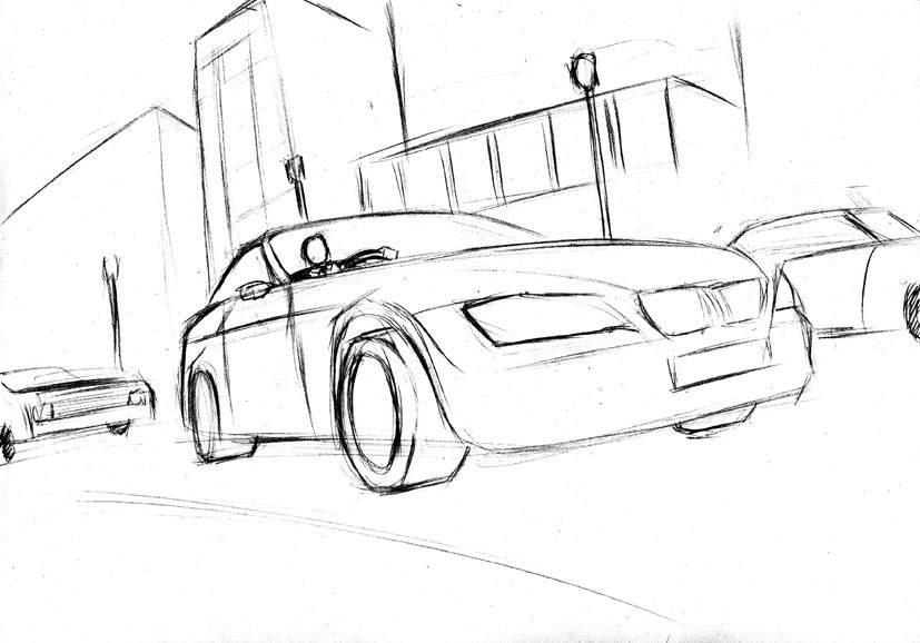
Last year, I helped Manchester-based Creative Agency "Contrast Creative" visualise a tyre ad.
Click here to see the tumblr feed...

Here is the main site... http://www.contrastcreative.co.uk/

....I thought it was time to share these with you.


Sketches like this were added to a simple template provided by
Contrast Creative before approval.


Once approved, I coloured my sketches digitally,
added a couple of gradients and tweaks. Contrast
Creative then added them to a more accurate template
complete with slogan and in the case of the above
example, a more exaggerated blur effect.


Tuesday, 10 January 2012

The Doomed Bird Of Providence

Last Year I was given the task of illustrating the cover and poster insert for the album "Will Ever Pray," the debut of Australian folk group "The Doomed Bird of Providence".

Final Cover


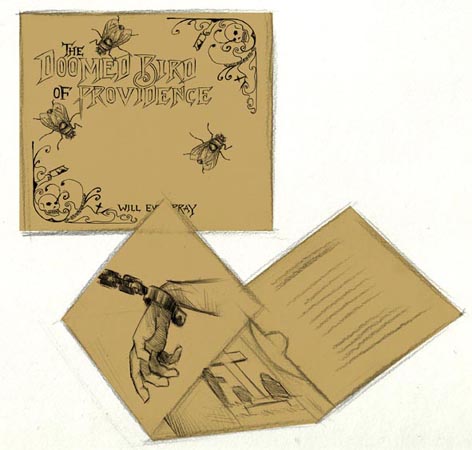
This was carried out under the guidance of Justin Watson. the man behind the record label Front and Follow. As with most projects the work began with sketches, banding ideas around etc. Though the motive of a fly was pretty much there from the start. Designer Damian O'Hara kept the final album art much simple than I had planned, which was much needed as I often lack the capacity for minimalism of any sort. As you can see from this mock-up.

One of the initial mock-ups

Aside from the fly motive the general theme of the album artwork, as also suggested by Doomed Bird frontman Mark Kluzek was to appear like an etching from the 19th century during which era the album is set; depicting a dark menacing world of genuine, bloody Australian history and downright grim tales of woe. Read more about it on the Front and Follow site.
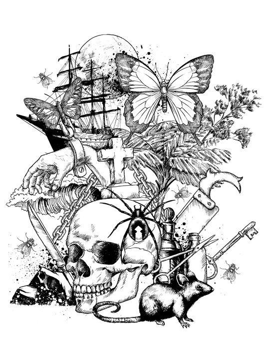
Poster insert

The images were drawn separately in pen using various references images. The actual cover and posters were ultimately screen printed. The poster also featured a banner designed by Damian which can be viewed on a T-shirt here. Unfortunately sold out! 
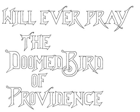
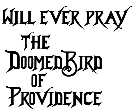
Text (a)

I am particularly proud of the text. It was derived from various wild and wonderful typefaces on Victorian-era books which I found from online images. Not knowing quite how it would look scaled down; the text was first drawn hollow as above.
Text (b)

With the final black text being the way to go. All art including text was drawn by hand. The poster drawings were also used in a promotional video by Paul Dawson aka THINKYMAN.

BZZZZZZZZZZZZ!!!!!