I was commissioned by Belinda for this event back in 2010, along with fellow illustrator Robin Clare who illustrated one or two of Belinda's other poems. (All illustrations below are by me.)
Items Found on Public Transport (by Belinda Bradley)
A Barbie birthday cake,
a “Nobody Likes Me” CD
by Alice Cooper,
a Misty Pink lipstick,
thirteen stick insects,
a mouldy cheese sandwich,
a goldfish named Slurpy,
a Nokia 1208 mobile phone,
a 2 year old,
a silver trombone,
a dinosaur bone,
a packet of brown rice,
six dead mice, white,
a “Kiss” wedding dress,
a prosthetic leg,
a last will and testament,
a copy of “Harry Potter
and the Philosopher’s Stone,”
£30,000 in used bank notes,
a black brolly,
a cat called Holly.
............
I Remember (by Belinda Bradley)
I remember...
the bus
red,
covered in cobwebs
in the garden shed.
I remember....
the blossom
pink,
daisies
on the olive sink.
I remember
……
my ragdoll
blue,
school shoes
shiny and new.
I remember
……
the white
swans
on the wall,
threadbare
carpet
in the narrow
hall.
I remember……
my grandma
calling a
dress “a frock,”
and saying
“you are
soppy” a lot.
I remember……
ballet lessons
and tap,
looking in the
mirrors
thinking I
looked fat.
I remember……
the first time
I was alone
with a boy in
my room,
my dad asking
“is he going
home soon?”
I remember ……
the day
my twin sister
left,
how I wept
and wept and
wept.
............
Through
the window of the Manchester train(by Belinda Bradley)
Back before I became an illustrator, TV commercials were only good for two things, allowing me to go to the toilet or to make a cup of tea. According to wikipedia a third of each hour that American imported shows like CSI are on, will be devoted to adverts. This allows for a gross excess of tea-making and danger of becoming diabetic. Thanks a lot mr Go Compare man! How about going away to compare landmines or something. Thankfully for me there is now a third use for adverts; making money through the medium of STORYBOARDS.
I first took an interest in 'boards during my time doing HND media at North Oxfordshire College in Banbury (1997-1999), following that course I carried out several storyboard jobs unpaid, for small film projects. (During that time I also purchased "The Art of the Storyboard" a book by John Hart, which is excellent.)
In fact, back then my goal was initially to work exlcusively as a "freelance storyboard artist." I didn't realise some years after giving up this dream, that storyboarding opportunities would come-a knocking. Interesting how life works out and as always I am hugely greatful for the opportunities which followed.
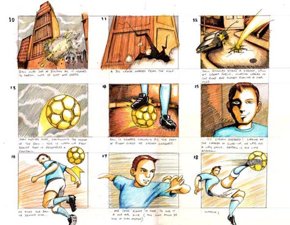
My first professional storyboard job happened when I was contacted back in 2007 by a film director called Paul Morgans who had seen some stylised "sequential" (comic) work on my website. The advert was for a Malaysian communications company called "CELCOM". No, I'd never heard of them either..
Click to enlarge
But, what I had heard of were the two protagonists who had signed up to be in the ad; no less than footballers Ryan Giggs and John Terry. (Yes most of my footballing knowledge is bizzarely centred around the 1990 World Cup... but somehow and despite the fact that Giggs and Terry do not appear on the popular dance track "World in Motion," a nugget of information regarding the notoriety of these two had managed to slip through.)
As is often the case, the deadline was excessively tight. Despite the above sample being in colour the individual panels soon degenerated into looser black and white line-drawings. My written and verbal instructions for the middle bulk of the advert were a touch vague and I was left come come up with alot of the shot ideas on my own, some of which were used, some of which weren't. As an freelancer, I was more naive in those days; today I would demand a much clearer step-by-step set of instructions; partly because I am more attuned to which instructions I need in order to operate. Looking back objectively, the idea of two footballers demolishing a city with a metallic football is a nutty concept in it's own right. With the relative proximity to the events of 9/11 it's a good job that they were not trying to pitch the concept to America.
In essence It's certainly true to say that director Paul was on hand to help out as much as he could, but the ethos of my end of the bargain seemed to be; draw as much stuff as possible to ultimately throw at the camera crew for shooting in Malaysia (No, I didn't get to go). I am still in touch with Paul, who is a thoroughly nice chap.
Watch this, resist the urge to make a cup of tea:
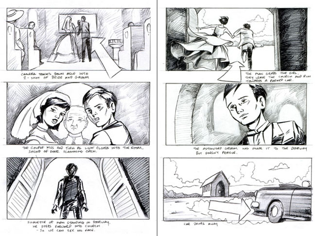
Next up we have storyboards for a 2010 jeans advert; a Russian jeans company called "Colin's Jeans" ...This time things were much more straight forward; I was contacted by a guy called Alex Sutherland, he was due to film in Istanbul for AZ Celtic Films ...Once again, I did not get to go away on the film shoot. *Sigh*
Click to enlarge
The 'boards were to have a graphic novel look about them. It's always nice when someone asks for that; keeps me interested. The advert is a homage to sun-kissed western "road movies" kind of Thelma and Louise meets The Lost Highway (I did say kind of.) So I had a style to stick to. A clear list of shots was kindly provided by Alex. A widescreen ratio, another ludicrously tight deadline (though why it always has to be that way is beyond me) and I was ready to go; about two weeks work in total.
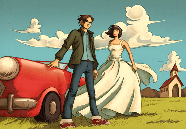
A task on the side was some concept art. Which looks pretty good, if I do say so myself. Pencil, pen and Photoshop. If nothing else this image has since provided some good filler material for my portfolio...
One bonus about the Colin's ad is that there was some behind the scenes footage taken in which you can actually see my storyboards in use...
Blink and you'll miss it.
Here's the final commercial:
More to come in Part 2: "Cakes and Beer." Actually not sure when exactly part 2 is going to be blogged. I think they are shooting the advert still. Need to check up on that. Watch this space!
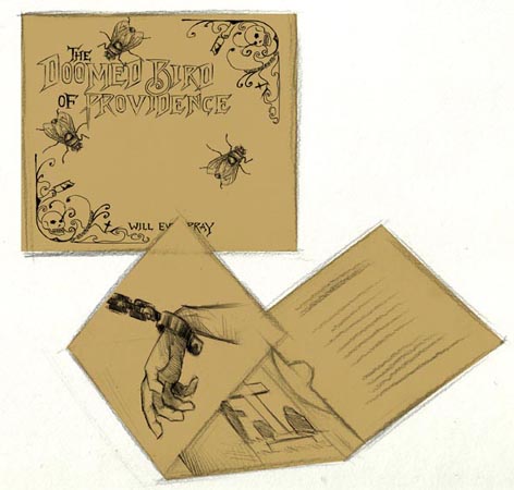
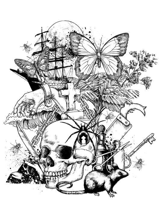
Last Year I was given the task of illustrating the cover and poster insert for the album "Will Ever Pray," the debut of Australian folk group "The Doomed Bird of Providence".
Final Cover
This was carried out under the guidance of Justin Watson. the man behind the record label Front and Follow. As with most projects the work began with sketches, banding ideas around etc. Though the motive of a fly was pretty much there from the start. Designer Damian O'Hara kept the final album art much simple than I had planned, which was much needed as I often lack the capacity for minimalism of any sort. As you can see from this mock-up.
One of the initial mock-ups
Aside from the fly motive the general theme of the album artwork, as also suggested by Doomed Bird frontman Mark Kluzek was to appear like an etching from the 19th century during which era the album is set; depicting a dark menacing world of genuine, bloody Australian history and downright grim tales of woe. Read more about it on the Front and Follow site.
Poster insert
The images were drawn separately in pen using various references images. The actual cover and posters were ultimately screen printed. The poster also featured a banner designed by Damian which can be viewed on a T-shirt here. Unfortunately sold out!
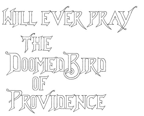
Text (a)
I am particularly proud of the text. It was derived from various wild and wonderful typefaces on Victorian-era books which I found from online images. Not knowing quite how it would look scaled down; the text was first drawn hollow as above.
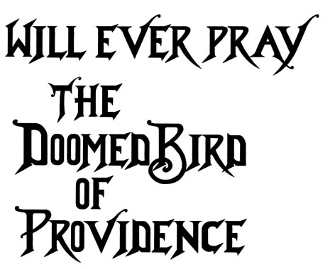
Text (b)
With the final black text being the way to go. All art including text was drawn by hand. The poster drawings were also used in a promotional video by Paul Dawson aka THINKYMAN.
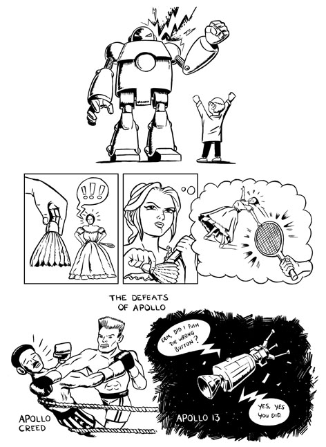
The title says it all really. For those that don't know, as well as working freelance I also have a job working at Manchester Art Gallery. Earlier this year I was asked if I'd like to have a crack at doing illustrated interpretations of some of the paintings for their then new Balcony Project. In which gallery decided to fill the balcony space full of paintings and statues; that particular area had been devoid of artworks since Manchester Art Gallery's huge makeover completed in 2002.
Manchester Art Gallery
My interpretations along with written interpretations from other people are availiable to view on a an interactive console in the gallery foyer, situated just below the balcony in question.
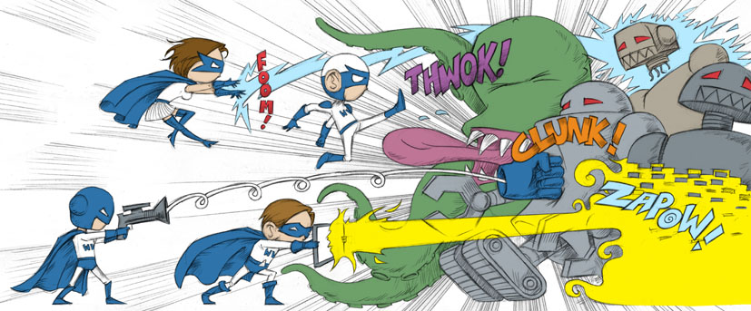
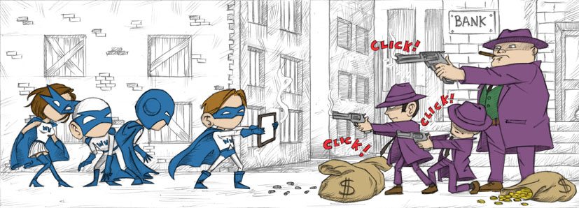
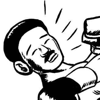
I'll leave you to interpret as to just why I came up with those images but suffice to say, I like drawing robots, comics and I've seen Rocky IV more times than anyone has a right to. Though I will be honest about that last one, I knew what I was going to draw after seeing the title alone.
Interesting factoid: The images are actually my first attempt at inking with a brush and I've been doing it ever since.
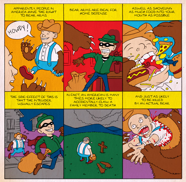
It was an idea that popped into my head that I felt I just had to get down on paper. Unfortunately this was just prior to my current obsession with traditional inking, so it doesn't quite have that vintage comic look that I was after. Also unfortunately, I recently saw an episode of Family Guy in which a similar "Bear arms" gag reared it's ugly head. Arrrgh! So just for the record, I made this, before I saw that.
The vague statistic in my comic strip is based on something I read about actual gun ownership in a Bill Bryson book. (Most likely "Notes from a Big Country" ...though I read it about ten years ago, if I could have been bothered to look up the actual passage which mentions the statistic as a percentage; I may have used it.)