Showing posts with label pen. Show all posts

Monday, 18 March 2019

Monday, 26 January 2015

Microsoft "Cortana" (not a Ford Cortina).

I created storyboards for a Microsoft "Cortana" advert starring BMX ace Danny MacAskill. The final ad is available to watch right HERE (you tube). Once again, that's me creating images for Microsoft, a fairly big deal and hopefully a platform to get more storyboard work.

Cortana is described as "an intelligent personal assistant on Windows Phones, PC's and tablets." Conversely I used pretty much the oldest media in human civilization in order to help THEM visualise an advert that probably cost many £millions to make.

I don't use a smart phone or a tablet so this is was all news to me... nor have they sent me one for my efforts!


There are 15 frames in total, created with pencil and a brush pen. My preferred method is to fit three frames on one sheet of A4 paper with each frame at 16 x 9cm ...conforming to the now standard 16:9 ratio. This leaves room for any notes on the sides, for either the client or for me to clarify the action.

Got it? Good!

Tuesday, 10 January 2012

The Doomed Bird Of Providence

Last Year I was given the task of illustrating the cover and poster insert for the album "Will Ever Pray," the debut of Australian folk group "The Doomed Bird of Providence".

Final Cover


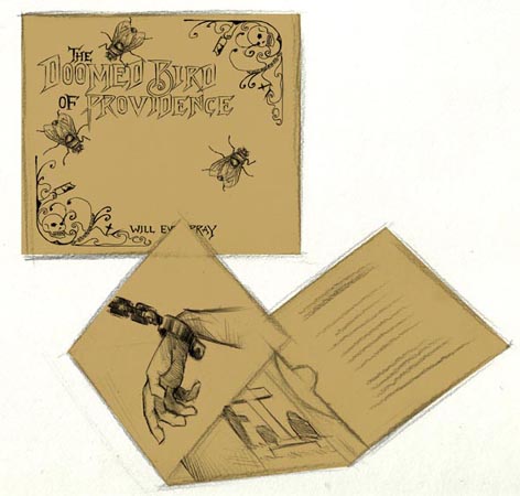
This was carried out under the guidance of Justin Watson. the man behind the record label Front and Follow. As with most projects the work began with sketches, banding ideas around etc. Though the motive of a fly was pretty much there from the start. Designer Damian O'Hara kept the final album art much simple than I had planned, which was much needed as I often lack the capacity for minimalism of any sort. As you can see from this mock-up.

One of the initial mock-ups

Aside from the fly motive the general theme of the album artwork, as also suggested by Doomed Bird frontman Mark Kluzek was to appear like an etching from the 19th century during which era the album is set; depicting a dark menacing world of genuine, bloody Australian history and downright grim tales of woe. Read more about it on the Front and Follow site.
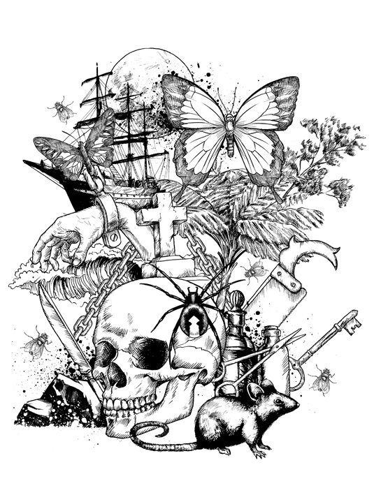
Poster insert

The images were drawn separately in pen using various references images. The actual cover and posters were ultimately screen printed. The poster also featured a banner designed by Damian which can be viewed on a T-shirt here. Unfortunately sold out! 
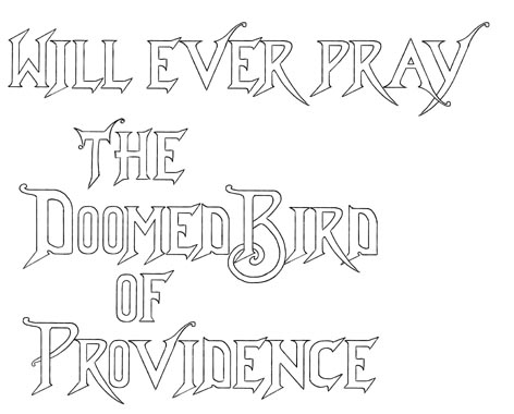
Text (a)

I am particularly proud of the text. It was derived from various wild and wonderful typefaces on Victorian-era books which I found from online images. Not knowing quite how it would look scaled down; the text was first drawn hollow as above.
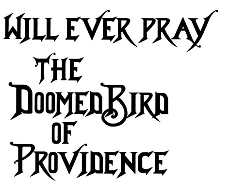
Text (b)

With the final black text being the way to go. All art including text was drawn by hand. The poster drawings were also used in a promotional video by Paul Dawson aka THINKYMAN.

BZZZZZZZZZZZZ!!!!!