Back before I became an illustrator, TV commercials were only good for two things, allowing me to go to the toilet or to make a cup of tea. According to wikipedia a third of each hour that American imported shows like CSI are on, will be devoted to adverts. This allows for a gross excess of tea-making and danger of becoming diabetic. Thanks a lot mr Go Compare man! How about going away to compare landmines or something. Thankfully for me there is now a third use for adverts; making money through the medium of STORYBOARDS.
I first took an interest in 'boards during my time doing HND media at North Oxfordshire College in Banbury (1997-1999), following that course I carried out several storyboard jobs unpaid, for small film projects. (During that time I also purchased "The Art of the Storyboard" a book by John Hart, which is excellent.)
In fact, back then my goal was initially to work exlcusively as a "freelance storyboard artist." I didn't realise some years after giving up this dream, that storyboarding opportunities would come-a knocking. Interesting how life works out and as always I am hugely greatful for the opportunities which followed.
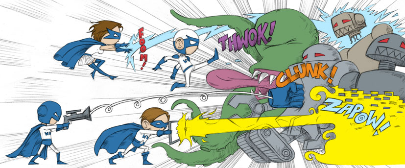
My first professional storyboard job happened when I was contacted back in 2007 by a film director called Paul Morgans who had seen some stylised "sequential" (comic) work on my website. The advert was for a Malaysian communications company called "CELCOM". No, I'd never heard of them either..
Click to enlarge
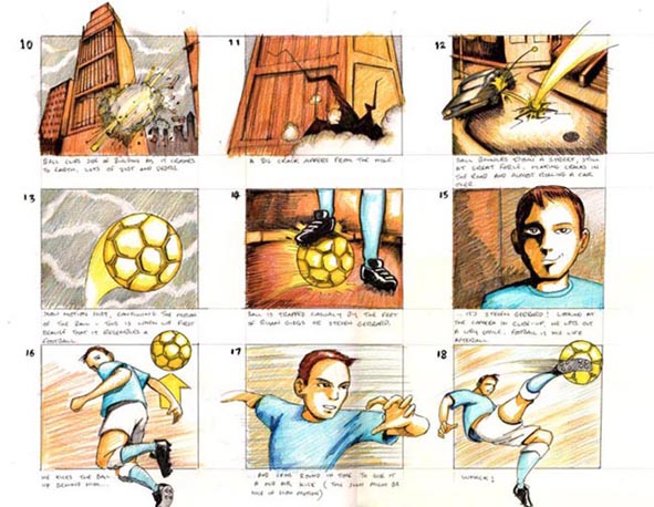
As is often the case, the deadline was excessively tight. Despite the above sample being in colour the individual panels soon degenerated into looser black and white line-drawings. My written and verbal instructions for the middle bulk of the advert were a touch vague and I was left come come up with alot of the shot ideas on my own, some of which were used, some of which weren't. As an freelancer, I was more naive in those days; today I would demand a much clearer step-by-step set of instructions; partly because I am more attuned to which instructions I need in order to operate. Looking back objectively, the idea of two footballers demolishing a city with a metallic football is a nutty concept in it's own right. With the relative proximity to the events of 9/11 it's a good job that they were not trying to pitch the concept to America.
In essence It's certainly true to say that director Paul was on hand to help out as much as he could, but the ethos of my end of the bargain seemed to be; draw as much stuff as possible to ultimately throw at the camera crew for shooting in Malaysia (No, I didn't get to go). I am still in touch with Paul, who is a thoroughly nice chap.
Watch this, resist the urge to make a cup of tea:
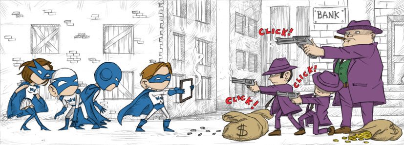
Next up we have storyboards for a 2010 jeans advert; a Russian jeans company called "Colin's Jeans" ...This time things were much more straight forward; I was contacted by a guy called Alex Sutherland, he was due to film in Istanbul for AZ Celtic Films ...Once again, I did not get to go away on the film shoot. *Sigh*
Click to enlarge
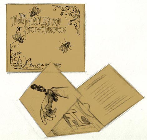
A task on the side was some concept art. Which looks pretty good, if I do say so myself. Pencil, pen and Photoshop. If nothing else this image has since provided some good filler material for my portfolio...

One bonus about the Colin's ad is that there was some behind the scenes footage taken in which you can actually see my storyboards in use...
Blink and you'll miss it.
Here's the final commercial: